
What is Python Treemap Visualization?
Python treemap visualization is a potent technique for data exploration and visual analysis, enabling users to grasp complex relationships swiftly. This method displays hierarchical data as a set of nested rectangles, each representing a category or subcategory. By using treemaps, analysts and data scientists can efficiently visualize large datasets, making it easier to identify patterns, outliers, and trends.
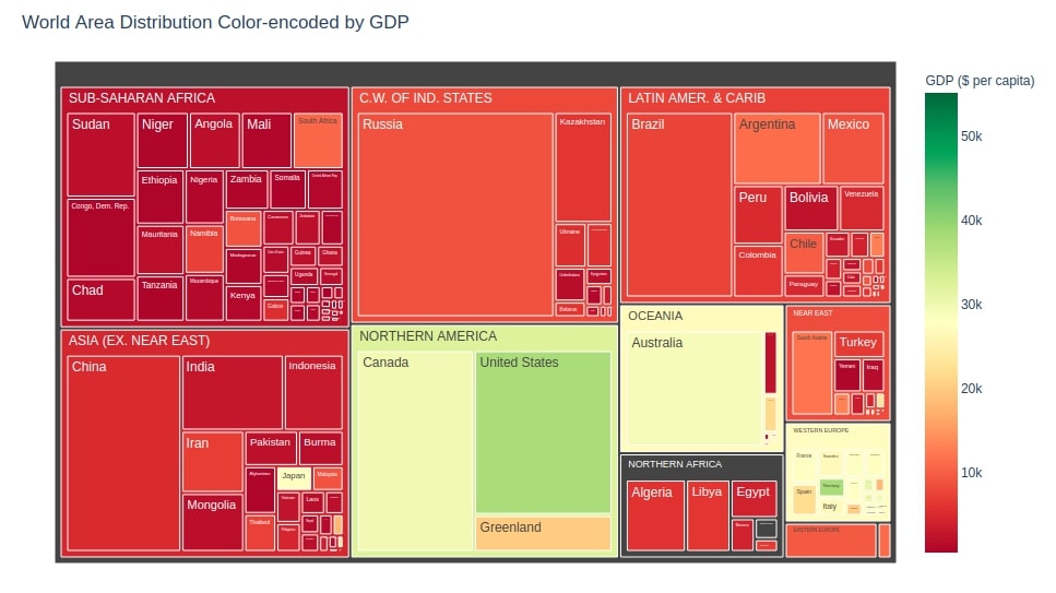
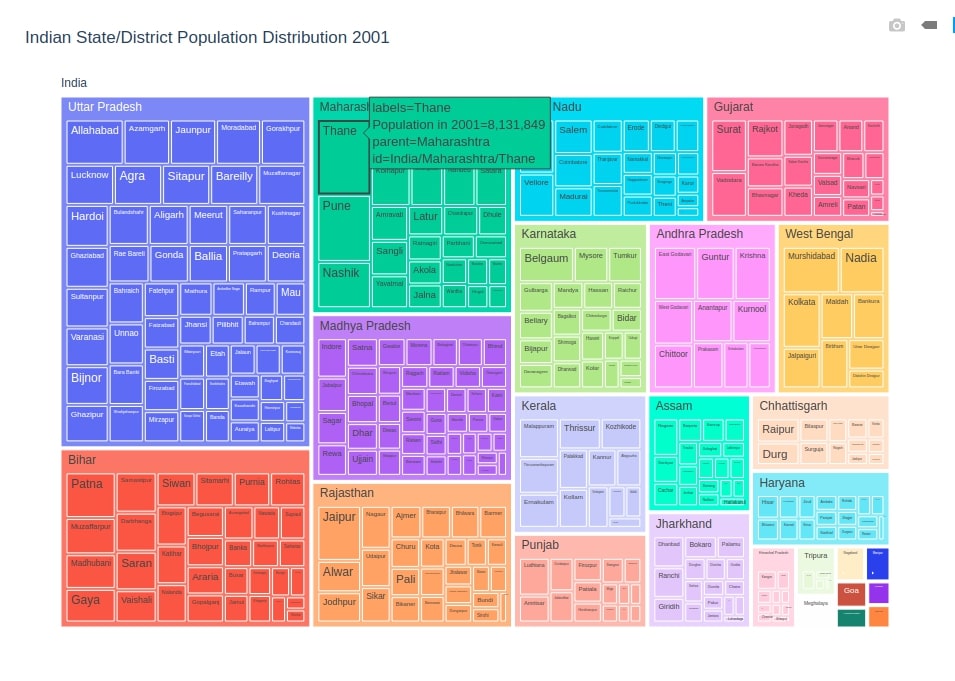
Treemaps are particularly useful for visualizing hierarchical data structures, such as file systems, organization charts, or multi-dimensional datasets. They offer an efficient use of space, allowing users to display a significant amount of information in a limited area. Moreover, treemaps can be customized to highlight specific data points or categories, providing a clear and concise representation of the underlying data.
The Python programming language offers several libraries for creating treemap visualizations, including Plotly, Bokeh, and Pygal. These libraries provide user-friendly interfaces and various customization options, making it easy for both beginners and experienced programmers to create informative and engaging treemaps.
In this article, we will explore the benefits of using Python treemap visualization, present the top Python libraries for creating treemaps, and provide a step-by-step guide on creating a treemap visualization. We will also discuss real-world applications, best practices, and future developments in Python treemap visualization.

Why Use Python Treemap Visualization?
Python treemap visualization is an effective tool for data analysis and visualization, offering numerous benefits for users. Its primary advantage lies in its ability to efficiently use space and clearly display hierarchical data, enabling users to grasp complex relationships quickly.
One of the key benefits of using Python treemap visualization is its capacity to identify patterns and outliers within large datasets. By representing data as nested rectangles, treemaps allow users to compare sizes and relationships at a glance, making it easier to spot anomalies or trends that might go unnoticed in traditional tabular representations.
Moreover, Python treemap visualization is highly customizable, allowing users to tailor the visualization to their specific needs. Users can modify colors, shapes, and sizes to highlight particular data points or categories, ensuring that the most relevant information is brought to the forefront. This flexibility makes treemaps an ideal choice for a wide range of applications, from financial analysis to network traffic analysis and sales performance analysis.
Another advantage of Python treemap visualization is its ability to accommodate various data formats and structures. Whether working with nested arrays, JSON objects, or CSV files, Python libraries such as Plotly, Bokeh, and Pygal provide seamless integration and conversion, enabling users to create treemaps with minimal data preparation.
In summary, Python treemap visualization offers a powerful and versatile solution for data exploration and visual analysis. Its ability to efficiently use space, clearly display hierarchical data, and identify patterns and outliers makes it an invaluable tool for data scientists, analysts, and researchers seeking to unlock insights and communicate findings effectively.
Top Python Libraries for Treemap Visualization
Python offers a rich ecosystem of libraries for creating treemap visualizations, each with its unique features and capabilities. Here are the top Python libraries for treemap visualization:
1. Plotly
Plotly is a popular open-source library for creating interactive visualizations, including treemaps. It supports various data formats, such as CSV, JSON, and Pandas DataFrames, and offers a wide range of customization options. Plotly’s Treemap charts enable users to drill down into hierarchical data, making it an ideal choice for financial analysis, sales performance analysis, and other data-intensive applications.
2. Bokeh
Bokeh is another powerful open-source library for creating interactive visualizations in Python. It offers a high-level interface for creating treemaps, as well as other chart types, and supports real-time data integration. Bokeh’s treemaps are highly customizable, allowing users to modify colors, shapes, and sizes to suit their specific needs.
3. Pygal
Pygal is a versatile library for creating static, interactive, and animated visualizations in Python. It offers a simple and intuitive interface for creating treemaps, as well as other chart types, and supports various data formats. Pygal’s treemaps are highly customizable, with options for modifying colors, fonts, and other visual elements.
These top Python libraries for treemap visualization offer a wide range of features and customization options, enabling users to create informative and engaging visualizations for various applications. By choosing the right library for their specific needs, users can unlock the full potential of Python treemap visualization for data exploration and visual analysis.
How to Create a Treemap Visualization in Python?
Creating a treemap visualization in Python involves several steps, including data preparation, coding, and customization. Here is a step-by-step guide on creating a treemap visualization using one of the top Python libraries, Plotly:
Step 1: Data Preparation
The first step in creating a treemap visualization is to prepare the data. This involves organizing the data in a hierarchical format, such as a nested list or a Pandas DataFrame. For example, suppose we have a dataset containing information about sales revenue by product category and subcategory:
import pandas as pd data = { 'category': ['Electronics', 'Electronics', 'Furniture', 'Furniture', 'Fashion', 'Fashion'], 'subcategory': ['Laptops', 'Smartphones', 'Beds', 'Sofas', 'Tops', 'Bottoms'], 'revenue': [1000, 800, 1500, 1200, 500, 700] } df = pd.DataFrame(data) Step 2: Importing the Library and Preparing the Data
The next step is to import the Plotly library and prepare the data for visualization. This involves converting the Pandas DataFrame into a format that Plotly can understand:
import plotly.express as px fig = px.treemap(df, path=['category', 'subcategory'], values='revenue') Step 3: Customizing the Treemap
Once the data is prepared, users can customize the treemap by modifying various visual elements, such as colors, labels, and layout:
fig.update_layout( title_text='Sales Revenue by Product Category and Subcategory', title_x=0.5, margin=dict(l=0, r=0, t=25, b=0) ) fig.update_traces( marker=dict( colors=['#008080', '#4CAF50', '#FFC107', '#F44336', '#9C27B0', '#E91E63'] ), textfont=dict(size=12), hovertemplate='Category: %{category}\nSubcategory: %{subcategory}\nRevenue: %{value:,}' ) Step 4: Visualizing the Treemap
Finally, users can visualize the treemap using Plotly’s interactive interface:
fig.show() By following these steps, users can create effective and informative treemap visualizations using Python and Plotly. By experimenting with different data formats, customization options, and visual elements, users can unlock the full potential of Python treemap visualization for data exploration and visual analysis.
Real-World Applications of Python Treemap Visualization
Python treemap visualization is a powerful tool for data exploration and visual analysis, offering numerous benefits for various applications. Here are some real-world examples of how Python treemap visualization can be used:
Financial Analysis
Python treemap visualization can be used to analyze financial data, such as revenue, expenses, and profits, by category and subcategory. For example, a financial analyst can use a treemap to visualize sales revenue by product category and subcategory, enabling them to identify the most profitable products and categories quickly.
Network Traffic Analysis
Python treemap visualization can be used to analyze network traffic data, such as IP addresses, ports, and protocols, enabling network administrators to identify patterns and anomalies quickly. For example, a treemap can be used to visualize network traffic by source and destination IP addresses, enabling administrators to identify potential security threats and bottlenecks.
Sales Performance Analysis
Python treemap visualization can be used to analyze sales performance data, such as sales revenue, units sold, and profit margins, by product, region, or salesperson. For example, a sales manager can use a treemap to visualize sales revenue by product and region, enabling them to identify the most profitable products and regions quickly.
Supply Chain Management
Python treemap visualization can be used to analyze supply chain data, such as inventory levels, lead times, and costs, by product, supplier, or location. For example, a supply chain manager can use a treemap to visualize inventory levels by product and supplier, enabling them to identify potential shortages and excess inventory quickly.
Market Research
Python treemap visualization can be used to analyze market research data, such as customer demographics, preferences, and behaviors, by segment or category. For example, a market researcher can use a treemap to visualize customer preferences by product category and demographics, enabling them to identify potential market opportunities and trends quickly.
These real-world applications demonstrate the versatility and power of Python treemap visualization for data exploration and visual analysis. By experimenting with different data formats, customization options, and visual elements, users can unlock the full potential of Python treemap visualization for various applications.

Best Practices for Python Treemap Visualization
Creating effective and informative treemap visualizations in Python requires careful planning, data preparation, and customization. Here are some best practices to keep in mind:
Use Consistent Color Schemes
Consistent color schemes can help users quickly identify patterns and relationships in the data. Use colors that are easy to distinguish and avoid using too many colors, which can create clutter and confusion. Consider using color-blind friendly palettes to ensure that all users can understand the visualization.
Avoid Clutter
Cluttered visualizations can be difficult to interpret and understand. Avoid using too many labels, markers, or other visual elements that can create clutter. Use white space effectively to separate different categories and subcategories, and consider using hierarchical treemaps to display complex relationships.
Provide Clear Labels
Clear labels can help users quickly understand the data being displayed. Use descriptive and concise labels that accurately reflect the data being visualized. Consider using tooltips or hovertext to provide additional context and information.
Customize the Layout
Customizing the layout of the treemap can help users better understand the data being displayed. Consider using different layout algorithms, such as squarify or slice-and-dice, to display the data in different ways. Experiment with different aspect ratios, padding, and border widths to create a visually appealing and informative treemap.
Use Interactive Visualizations
Interactive visualizations can help users explore and analyze the data more effectively. Consider using tools like Plotly or Bokeh to create interactive treemaps that allow users to zoom, pan, and hover over different categories and subcategories. Interactive visualizations can also help users identify patterns and outliers more quickly.
Test and Refine the Visualization
Testing and refining the visualization can help ensure that it is effective and informative. Consider sharing the visualization with colleagues or stakeholders to get feedback and suggestions for improvement. Experiment with different data formats, customization options, and visual elements to create the most effective and informative treemap possible.
By following these best practices, users can create effective and informative treemap visualizations in Python that enable them to explore and analyze complex hierarchical data quickly and efficiently.
Trends and Future Developments in Python Treemap Visualization
Python treemap visualization is a rapidly evolving field, with new trends and developments emerging regularly. Here are some of the latest trends and future developments to watch for in Python treemap visualization:
Interactive Visualizations
Interactive visualizations are becoming increasingly popular in Python treemap visualization. Interactive visualizations allow users to explore and analyze the data more effectively by zooming, panning, and hovering over different categories and subcategories. Interactive visualizations can also help users identify patterns and outliers more quickly.
Real-Time Data Integration
Real-time data integration is another trend in Python treemap visualization. Real-time data integration enables users to visualize and analyze data as it is generated, providing up-to-the-minute insights and information. Real-time data integration can be particularly useful in applications such as network traffic analysis, financial analysis, and sales performance analysis.
Machine Learning Algorithms
Machine learning algorithms are being increasingly integrated into Python treemap visualization. Machine learning algorithms can help users identify patterns and trends in the data that might not be immediately apparent. Machine learning algorithms can also help users make predictions and forecasts based on the data.
Big Data Visualization
Big data visualization is becoming increasingly important in Python treemap visualization. Big data visualization enables users to visualize and analyze large and complex datasets quickly and efficiently. Big data visualization can be particularly useful in applications such as supply chain management, market research, and scientific research.
Virtual and Augmented Reality
Virtual and augmented reality are emerging trends in Python treemap visualization. Virtual and augmented reality can provide immersive and interactive visualizations that enable users to explore and analyze data in new and innovative ways. Virtual and augmented reality can be particularly useful in applications such as scientific research, engineering, and product design.
By staying up-to-date with the latest trends and developments in Python treemap visualization, users can ensure that they are making the most of this powerful tool for data analysis and visualization. By experimenting with new libraries, tools, and techniques, users can unlock new insights and perspectives on their data, and make more informed decisions based on data-driven insights.
Conclusion: Making the Most of Python Treemap Visualization
Python treemap visualization is a powerful tool for data exploration and visual analysis. By displaying hierarchical data as a set of nested rectangles, treemaps enable users to grasp complex relationships quickly and efficiently. Treemaps offer numerous benefits, including efficient use of space, clear display of hierarchical data, and the ability to identify patterns and outliers.
There are several top Python libraries for creating treemap visualizations, including Plotly, Bokeh, and Pygal. Each library offers unique features and capabilities, enabling users to customize their treemaps to meet their specific needs. By following best practices for creating effective and informative treemaps, users can ensure that their visualizations are clear, concise, and easy to understand.
Python treemap visualization has numerous real-world applications, from financial analysis and network traffic analysis to sales performance analysis and beyond. By experimenting with different data formats, customization options, and visual elements, users can unlock new insights and perspectives on their data, and make more informed decisions based on data-driven insights.
The latest trends and future developments in Python treemap visualization include interactive visualizations, real-time data integration, and machine learning algorithms. By staying up-to-date with these trends and developments, users can ensure that they are making the most of this powerful tool for data analysis and visualization. Whether you are a data scientist, analyst, or researcher, Python treemap visualization offers a wealth of opportunities for exploring and analyzing complex hierarchical data in new and innovative ways.
In conclusion, we encourage readers to explore and experiment with Python treemap visualization. By mastering the art of treemap visualization, you can unlock new insights and perspectives on your data, and make more informed decisions based on data-driven insights. So why wait? Start exploring the power of Python treemap visualization today!
