
The Power of PowerBI Designs
PowerBI designs play a crucial role in transforming raw data into actionable insights, enabling organizations to make informed decisions. By creating well-designed PowerBI reports and dashboards, users can effectively communicate complex data stories, improving user experience and facilitating decision-making processes.
PowerBI designs encompass various elements, including data visualization types, layout, formatting, and interactivity. By carefully considering these components, users can create visually appealing and functional PowerBI designs that cater to their specific needs and audience.
The importance of PowerBI designs lies in their ability to present data in a clear, concise, and engaging manner. A well-designed PowerBI report or dashboard can help users identify patterns, trends, and correlations within their data, ultimately driving business growth and success.
https://www.youtube.com/watch?v=dx_PTIwYC9o
Key Elements of PowerBI Designs
PowerBI designs consist of several essential elements that contribute to their overall effectiveness. These components include data visualization types, layout, formatting, and interactivity. By understanding and mastering these elements, users can create visually appealing and functional PowerBI designs that cater to their specific needs and audience.
Data Visualization Types
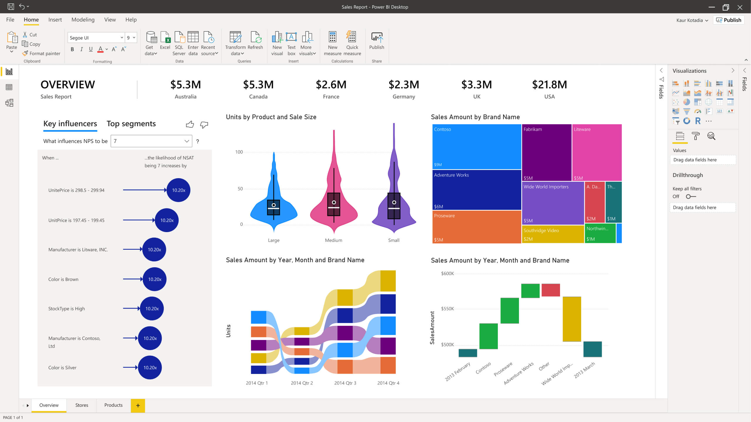
Choosing the right data visualization type is crucial for conveying the intended message effectively. PowerBI supports a wide range of visualization types, such as bar charts, line charts, scatter plots, area charts, and tree maps. Users should consider the nature of their data and the message they want to convey when selecting the most appropriate visualization type.
Layout
A well-designed PowerBI report or dashboard should have a logical flow and easy navigation. Users should organize and arrange report elements, such as visuals, titles, and filters, in a way that guides the user’s attention and facilitates data exploration. Best practices for PowerBI layout include using whitespace effectively, grouping related elements, and maintaining a consistent grid system.
Formatting
Consistent formatting is essential for maintaining a professional appearance in PowerBI designs. Users should consider themes, colors, fonts, and data labels when formatting their PowerBI reports and dashboards. Applying a consistent theme throughout the design ensures visual harmony, making it easier for users to interpret and understand the data.
Interactivity
Interactivity in PowerBI designs allows users to engage with the data and explore it in more depth. Features such as filters, slicers, and drill-through enable users to customize their view of the data, revealing insights that might otherwise go unnoticed. By incorporating interactivity into PowerBI designs, users can create more dynamic and user-friendly reports and dashboards.
https://www.youtube.com/watch?v=KlGhpvevLYw
Selecting the Right Data Visualization for Your PowerBI Design
Choosing the most appropriate data visualization type is crucial for effectively conveying the intended message in your PowerBI design. To make the right choice, consider the nature of your data, the message you want to convey, and your target audience. By carefully selecting the data visualization type, you can ensure that your PowerBI design is both informative and engaging.
Understanding Your Data
The first step in selecting the right data visualization type is understanding the nature of your data. Consider the following factors:
- Data type: Is your data categorical, numerical, or a mix of both?
- Data volume: How much data are you working with? Large datasets may require different visualization types than smaller datasets.
- Data relationships: Are there any relationships or patterns within your data that you want to highlight?
Defining Your Message
Once you have a clear understanding of your data, determine the message you want to convey. Are you trying to compare values, show a distribution, or illustrate a trend? Different messages call for different visualization types. For example:
- Comparing values: Use bar charts, column charts, or pie charts.
- Showing a distribution: Utilize histograms, box plots, or scatter plots.
- Illustrating a trend: Employ line charts, area charts, or stacked column charts.
Considering Your Audience
Lastly, consider your target audience when selecting a data visualization type. Will they be familiar with the visualization type you choose? Is the visualization type you’ve selected the best way to convey your message to your audience? For instance, if your audience is not data-savvy, you may want to avoid complex visualization types like heatmaps or Sankey diagrams.

Designing an Intuitive Layout for PowerBI Reports
A well-designed PowerBI report should have a logical flow and easy navigation, ensuring that users can quickly find the information they need. By following best practices for organizing and arranging report elements, you can create an intuitive layout that enhances user experience and facilitates data exploration.
Best Practices for PowerBI Layout
Consider the following best practices when designing the layout of your PowerBI report:
- Use whitespace effectively: Whitespace helps to separate report elements and makes the report easier to read. Be sure to leave enough space between visuals, titles, and filters to ensure a clean and uncluttered appearance.
- Group related elements: Organize related report elements into logical groups, making it easier for users to understand the relationships between different pieces of information. Use visual containers, such as report pages or sections, to group related visuals together.
- Maintain a consistent grid system: Adhere to a consistent grid system to ensure that report elements are aligned and evenly spaced. This practice helps to create a visually appealing layout and makes the report easier to navigate.
- Create a clear hierarchy: Establish a clear hierarchy of information by using size, color, and placement to draw attention to the most important data points. This helps users to quickly identify the key insights within the report.
- Ensure mobile compatibility: Design your PowerBI report to be mobile-friendly, allowing users to access the report on various devices. PowerBI provides built-in mobile layout views, enabling you to optimize the report for different screen sizes.

Formatting PowerBI Designs for Professional Appearance
Consistent formatting plays a significant role in creating professional-looking PowerBI designs. By adhering to a consistent theme, using appropriate colors, selecting the right fonts, and formatting data labels, you can ensure that your PowerBI reports and dashboards maintain a polished and cohesive appearance.
Themes
Themes in PowerBI enable you to apply a consistent color palette, font, and style to your entire report. By using a pre-built theme or creating a custom theme, you can ensure that your PowerBI design maintains a professional appearance and adheres to your organization’s branding guidelines.
Colors
Colors are an essential aspect of data visualization, as they can help to convey meaning and draw attention to specific data points. When selecting colors for your PowerBI design, consider the following:
- Use contrasting colors for text and backgrounds to ensure readability.
- Limit the number of colors used in a single visual to avoid overwhelming the user.
- Choose colors that are accessible to users with color vision deficiencies.
Fonts
Selecting the right font for your PowerBI design can improve readability and contribute to a professional appearance. Consider the following:
- Choose a font that is easy to read, even at smaller sizes.
- Limit the number of fonts used in your report to maintain consistency and avoid confusion.
- Ensure that the font size is large enough to be easily read on various devices and screen sizes.
Data Labels
Formatting data labels appropriately can help to improve the clarity of your PowerBI visuals. Consider the following:
- Ensure that data labels are large enough to be easily read.
- Use contrasting colors for data labels and backgrounds to improve readability.
- Truncate or abbreviate long data labels to prevent visual clutter.
Enhancing PowerBI Designs with Interactivity
Interactivity in PowerBI designs can significantly improve user engagement and facilitate data exploration. By incorporating features such as filters, slicers, and drill-through, you can create dynamic and interactive reports that cater to the unique needs of your audience.
Filters
Filters in PowerBI allow users to focus on specific data subsets, making it easier to analyze and interpret the information. You can apply filters at various levels, including report, page, and visual-level filters. By providing users with the ability to filter data based on their specific needs, you can create a more personalized and engaging user experience.
Slicers
Slicers are visual filters that enable users to interactively filter data by selecting values within a visual. Slicers are particularly useful when working with large datasets, as they allow users to quickly narrow down the data to specific categories or time periods. By incorporating slicers into your PowerBI design, you can make it easier for users to find the information they need and explore the data in more depth.
Drill-Through
Drill-through in PowerBI enables users to navigate from one report page to another, based on a specific data point. This feature allows users to explore data in greater detail, moving from a high-level overview to more granular data as needed. By incorporating drill-through functionality into your PowerBI design, you can create a more engaging and interactive user experience, enabling users to delve deeper into the data and uncover valuable insights.
Best Practices for Interactive PowerBI Designs
Consider the following best practices when incorporating interactivity into your PowerBI designs:
- Ensure that interactive elements are clearly labeled and easy to find.
- Limit the number of interactive elements on a single report page to avoid overwhelming the user.
- Test interactive elements thoroughly to ensure that they function as intended and provide the desired user experience.
- Provide clear instructions or tooltips to guide users in using interactive elements effectively.

Real-Life PowerBI Design Examples: Success Stories and Lessons Learned
Exploring real-life examples of successful PowerBI designs can provide valuable insights and inspiration for your own projects. By examining successful PowerBI designs, you can learn about best practices, innovative concepts, and potential pitfalls to avoid. In this section, we will share examples of successful PowerBI designs, highlighting their key features, achievements, and lessons learned.
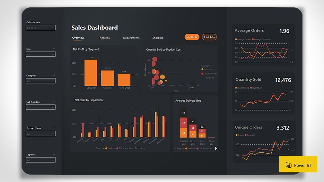
Example 1: Sales Performance Dashboard
The sales performance dashboard is a popular example of a successful PowerBI design. This dashboard typically includes visualizations that display sales data, such as sales revenue, sales by region, and sales by product category. By incorporating interactive elements, such as filters and slicers, users can easily explore the data and gain insights into sales performance.
Key Features:
- Interactive maps displaying sales by region
- Bar charts comparing sales by product category
- Line charts illustrating sales trends over time
- Drill-through functionality enabling users to explore sales data at a granular level
Example 2: Customer Segmentation Dashboard
The customer segmentation dashboard is another successful PowerBI design example. This dashboard categorizes customers based on shared characteristics, enabling businesses to tailor marketing strategies and improve customer engagement. By incorporating data visualization best practices, this dashboard provides a clear and concise overview of customer segments and their associated characteristics.
Key Features:
- Treemaps displaying customer segments and their associated revenue
- Scatter plots illustrating customer behavior patterns
- Bar charts comparing customer demographics across segments
- Interactive filters enabling users to explore customer segments based on various criteria
Lessons Learned
Through these real-life PowerBI design examples, several lessons can be learned:
- Interactive elements, such as filters and slicers, can significantly improve user engagement and data exploration.
- Data visualization best practices, such as using contrasting colors and maintaining a consistent layout, can enhance the clarity and usability of PowerBI designs.
- Drill-through functionality enables users to explore data in greater detail, uncovering valuable insights and actionable intelligence.
Continuous Improvement: Updating and Optimizing PowerBI Designs
Regularly updating and optimizing your PowerBI designs is crucial for maintaining their relevance, accuracy, and effectiveness. By considering new data, user feedback, and technological advancements, you can ensure that your PowerBI designs remain valuable tools for data visualization and decision-making. In this section, we will discuss the importance of continuous improvement in PowerBI designs and provide best practices for updating and optimizing your PowerBI reports and dashboards.
Monitoring New Data
Staying up-to-date with new data is essential for maintaining the accuracy and relevance of your PowerBI designs. Regularly review your data sources and incorporate new data as it becomes available. By keeping your PowerBI designs current, you can ensure that users have access to the most recent information and can make informed decisions based on accurate data.
Collecting User Feedback
User feedback is an invaluable resource for identifying areas for improvement in your PowerBI designs. Encourage users to provide feedback on the usability, clarity, and effectiveness of your PowerBI reports and dashboards. By incorporating user suggestions and addressing pain points, you can create PowerBI designs that better meet the needs of your audience and enhance their overall user experience.
Staying Informed of Technological Advancements
Technological advancements in data visualization and PowerBI features can significantly impact the effectiveness of your PowerBI designs. Stay informed of new PowerBI features, updates, and best practices by following official Microsoft PowerBI blogs, attending webinars, and participating in PowerBI user groups. By incorporating innovative concepts and cutting-edge techniques, you can create PowerBI designs that are both visually stunning and highly functional.
Best Practices for Continuous Improvement
Consider the following best practices when updating and optimizing your PowerBI designs:
- Schedule regular reviews of your PowerBI designs to identify areas for improvement and update data sources.
- Implement a feedback mechanism to collect user suggestions and address pain points.
- Experiment with new PowerBI features and data visualization techniques to enhance the functionality and appearance of your PowerBI designs.
- Monitor PowerBI user groups, blogs, and webinars to stay informed of new trends and best practices in PowerBI design.
