Power BI Matrix vs Table: An Overview
Data visualization is a critical aspect of data analysis and reporting. Power BI, a popular business intelligence tool from Microsoft, offers several features for creating interactive and informative visualizations. Two such features are Power BI Matrix and Power BI Table. In this article, we will explore these two features, their differences, and their use cases to help you make an informed decision when creating your next Power BI report.
Understanding Power BI Matrix
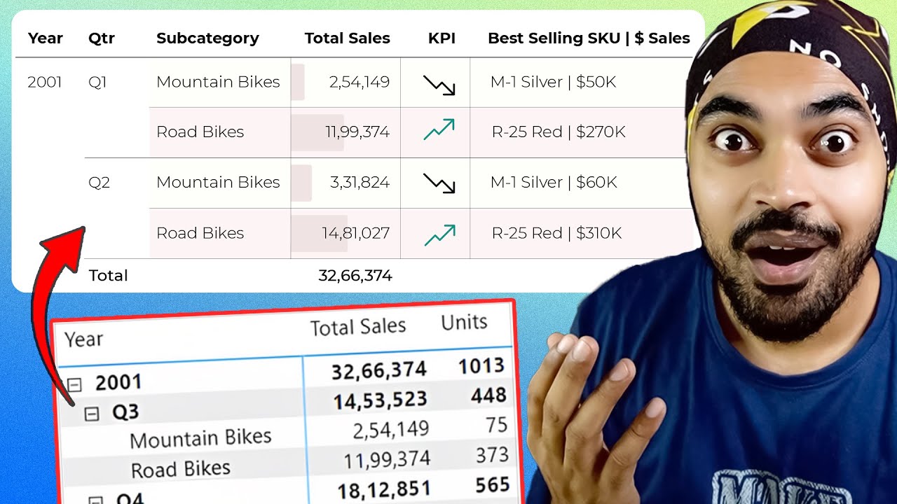
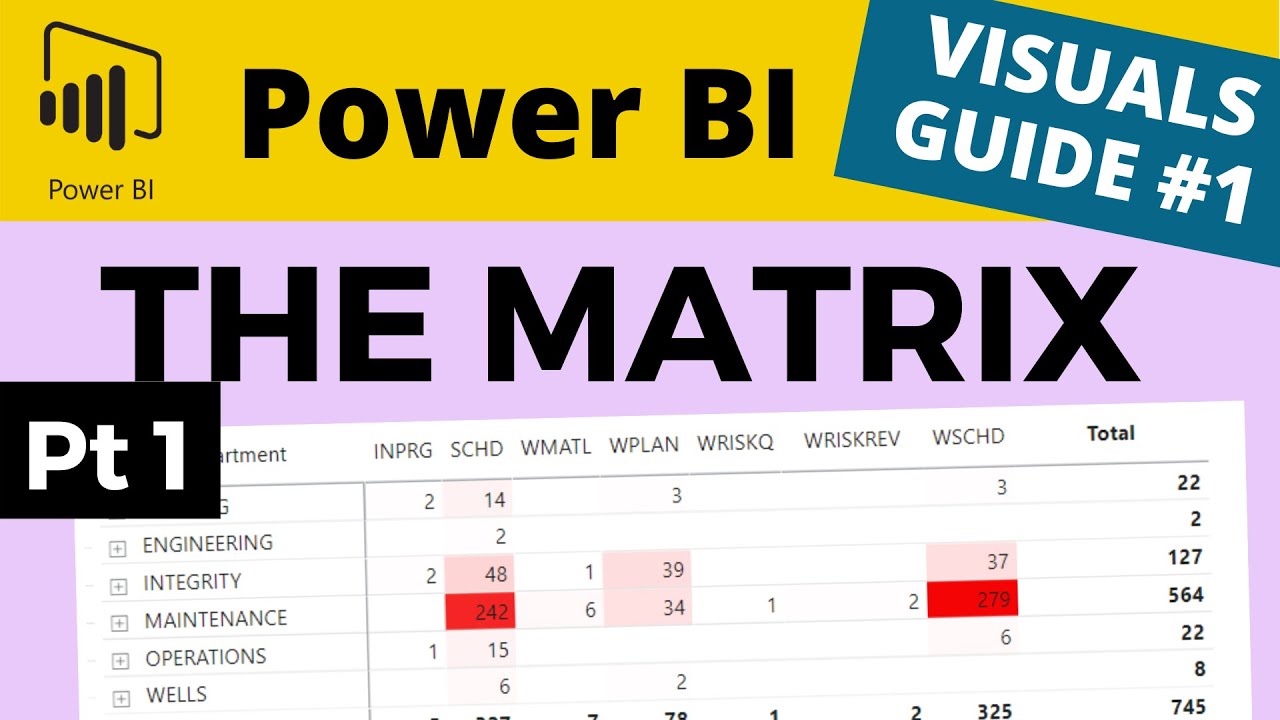
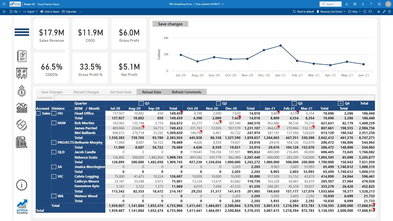
Power BI Matrix is a powerful data visualization tool that allows users to create cross-tabulations and hierarchies, making it ideal for displaying complex data. It is particularly useful when working with multi-dimensional data sets, such as sales figures broken down by region, product, and time period. By organizing data in a tabular format, Power BI Matrix helps users quickly identify trends, patterns, and correlations, making it an invaluable tool for data analysis and reporting.
Power BI Matrix offers several features that set it apart from other data visualization tools. For instance, it supports hierarchical drill-down, enabling users to explore data at different levels of granularity. It also allows for conditional formatting, which can help highlight important data points or anomalies. Additionally, Power BI Matrix supports advanced calculations, such as running totals and moving averages, which can provide valuable insights into data trends.
Real-world examples of Power BI Matrix usage include sales performance analysis, inventory management, and financial reporting. By organizing sales data in a matrix format, users can easily identify top-performing products, regions, and salespeople. Similarly, inventory managers can use Power BI Matrix to track stock levels and identify products that require reordering. In financial reporting, Power BI Matrix can help users analyze financial statements, identify cost drivers, and track performance against budgets.
Exploring Power BI Table
Power BI Table is a simple yet effective data visualization tool that displays data in a tabular format. Unlike Power BI Matrix, it does not support hierarchies or cross-tabulations, making it more suitable for displaying flat data structures. Power BI Table is ideal for presenting data that does not require complex analysis or comparison.
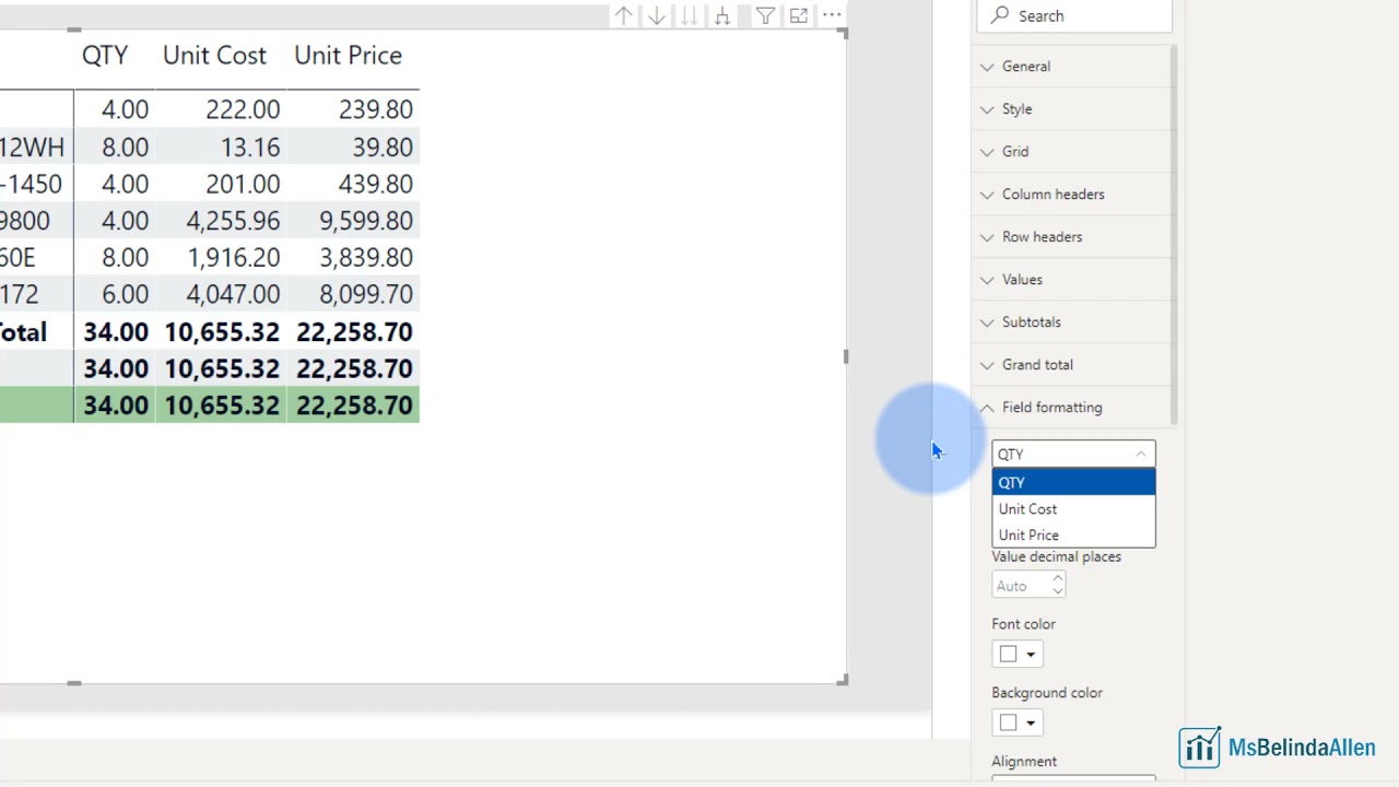
Power BI Table offers several features that make it an attractive option for data visualization. For instance, it supports conditional formatting, enabling users to highlight important data points or anomalies. It also allows for data sorting and filtering, making it easy for users to find the information they need. Additionally, Power BI Table supports custom formatting, which can help users tailor the visualization to their specific needs.
Typical use cases for Power BI Table include displaying simple data sets, such as contact lists, product catalogs, or inventory records. By presenting data in a tabular format, Power BI Table makes it easy for users to scan and compare information. It is also useful for displaying data that does not require complex analysis, such as text-heavy data or data with few variables.
Examples of when to use Power BI Table instead of Matrix include displaying contact information, presenting product catalogs, or listing inventory records. By using Power BI Table in these scenarios, users can quickly find the information they need without having to navigate complex hierarchies or cross-tabulations.

How to Choose Between Power BI Matrix and Table
Deciding between Power BI Matrix and Table depends on several factors, including data complexity, visualization needs, and user experience. By considering these factors, you can ensure that you choose the right tool for your data visualization needs.
First, assess the complexity of your data. If your data has multiple dimensions or hierarchies, Power BI Matrix is likely the better choice. It allows you to create cross-tabulations and hierarchies, making it easier to analyze complex data. On the other hand, if your data is simple and flat, Power BI Table may be more appropriate.
Next, consider your visualization needs. If you need to compare data across multiple dimensions or hierarchies, Power BI Matrix is the better option. However, if you only need to present simple data, Power BI Table may be more suitable. It is also worth noting that Power BI Table is better suited for displaying text-heavy data or data with few variables.
Finally, think about the user experience. Power BI Matrix can be more challenging to navigate for users unfamiliar with hierarchical data structures. In contrast, Power BI Table is more straightforward and intuitive. Consider your audience and their familiarity with data visualization tools when making your decision.
By considering these factors, you can ensure that you choose the right tool for your data visualization needs. Remember, there is no one-size-fits-all solution, and it is essential to experiment with both features to find the best fit for your data.

Best Practices for Using Power BI Matrix and Table
When using Power BI Matrix and Table, it is essential to follow best practices to ensure that your data visualizations are effective and engaging. Here are some best practices to keep in mind:
- Format your data: Proper data formatting is crucial for creating effective data visualizations. Ensure that your data is clean, consistent, and accurately formatted. Use number formatting, date formatting, and conditional formatting to make your data easier to read and interpret.
- Design for user experience: Consider your audience and their needs when designing your data visualizations. Use clear and concise titles, labels, and legends to help users understand the data. Avoid cluttering your visualizations with unnecessary information or elements.
- Engage your audience: Use interactive elements, such as filters, slicers, and drill-down capabilities, to engage your audience and encourage exploration. Provide context and insights to help users understand the data and make informed decisions.
By following these best practices, you can create effective and engaging data visualizations using Power BI Matrix and Table. Remember to experiment with both features and find the best fit for your data visualization needs.

Common Pitfalls to Avoid When Using Power BI Matrix and Table
When using Power BI Matrix and Table, there are several common pitfalls to avoid. Here are some of the most common mistakes and how to avoid them:
- Data misinterpretation: Data visualizations can be misleading if not designed correctly. Avoid using too many data points, using the wrong chart type, or displaying data out of context. Ensure that your data is accurate, relevant, and easy to understand.
- Visualization clutter: Cluttered visualizations can be overwhelming and difficult to interpret. Avoid using too many colors, labels, or gridlines. Use white space effectively and ensure that your visualizations are clean, simple, and easy to read.
- Ineffective formatting: Poorly formatted data visualizations can be difficult to read and interpret. Avoid using small font sizes, low-contrast colors, or unclear labels. Use formatting techniques, such as conditional formatting, to highlight important data points and make your visualizations more effective.
By avoiding these common pitfalls, you can create effective and accurate data visualizations using Power BI Matrix and Table. Remember to keep your visualizations simple, clear, and easy to understand, and always double-check your data for accuracy.
Advanced Techniques for Using Power BI Matrix and Table
Once you have mastered the basics of Power BI Matrix and Table, you can explore advanced techniques to take your data visualizations to the next level. Here are some advanced techniques to consider:
- Data modeling: Power BI provides powerful data modeling capabilities that allow you to create complex data relationships and hierarchies. Use data modeling techniques to create sophisticated data models that can handle large and complex data sets.
- Custom visualizations: Power BI offers a wide range of custom visualizations that can help you create unique and engaging data visualizations. Experiment with different visualization types, such as gauges, treemaps, and sankey diagrams, to find the best fit for your data.
- Integrations with other tools: Power BI can be integrated with a wide range of other tools and platforms, such as Excel, Power Automate, and Power Apps. Use these integrations to automate data workflows, create custom reports, and extend the functionality of Power BI.
By exploring these advanced techniques, you can create more sophisticated and engaging data visualizations using Power BI Matrix and Table. Remember to always keep your audience and visualization goals in mind, and experiment with different techniques to find the best fit for your data.
Conclusion: Power BI Matrix vs Table – Which One to Choose
In conclusion, Power BI Matrix and Table are both powerful data visualization tools that can help you create engaging and informative reports. The choice between Matrix and Table ultimately depends on your data complexity, visualization needs, and user experience. Here are some key takeaways to help you decide:
- Data complexity: If your data is complex and requires hierarchical or cross-tabular displays, Power BI Matrix is the better choice. If your data is simple and flat, Power BI Table is sufficient.
- Visualization needs: If you need to compare data across multiple dimensions or hierarchies, Power BI Matrix is the better choice. If you only need to present simple data, Power BI Table is sufficient.
- User experience: Consider your audience and their needs when choosing between Matrix and Table. Power BI Matrix can be more challenging to navigate for users unfamiliar with hierarchical data structures. In contrast, Power BI Table is more straightforward and intuitive.
Remember, there is no one-size-fits-all solution when it comes to data visualization. Experiment with both Power BI Matrix and Table, and find the best fit for your data visualization needs. By following best practices, avoiding common pitfalls, and exploring advanced techniques, you can create engaging and informative reports that provide value and insights to your audience.