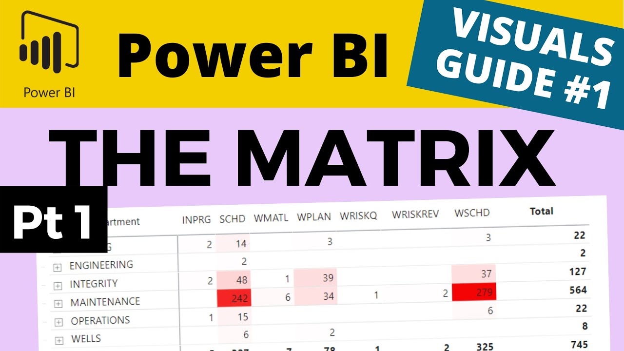
Introduction: The Power of Power BI Matrix
Power BI Matrix is a powerful tool in data visualization, enabling users to effectively display and analyze complex data sets. One of its key features is the ability to display multiple columns, which can significantly enhance the analysis process. By organizing data into columns, users can easily compare and contrast different data points, identify trends and patterns, and make informed decisions.
Understanding the Basics: Creating a Power BI Matrix
Creating a Power BI Matrix is a straightforward process. To begin, select the data you wish to visualize and navigate to the “Values” section of the “Fields” pane. Drag and drop the desired fields into the “Values” area. By default, Power BI will create a table visualization. To convert this table into a Matrix, click on the “Table” icon in the Visualizations pane and select “Matrix.”
Once you have created a Matrix, you can adjust the formatting to suit your needs. This includes adjusting the size and color of text, as well as adding borders and other visual elements. To access the formatting options, click on the “Format” button in the Visualizations pane.
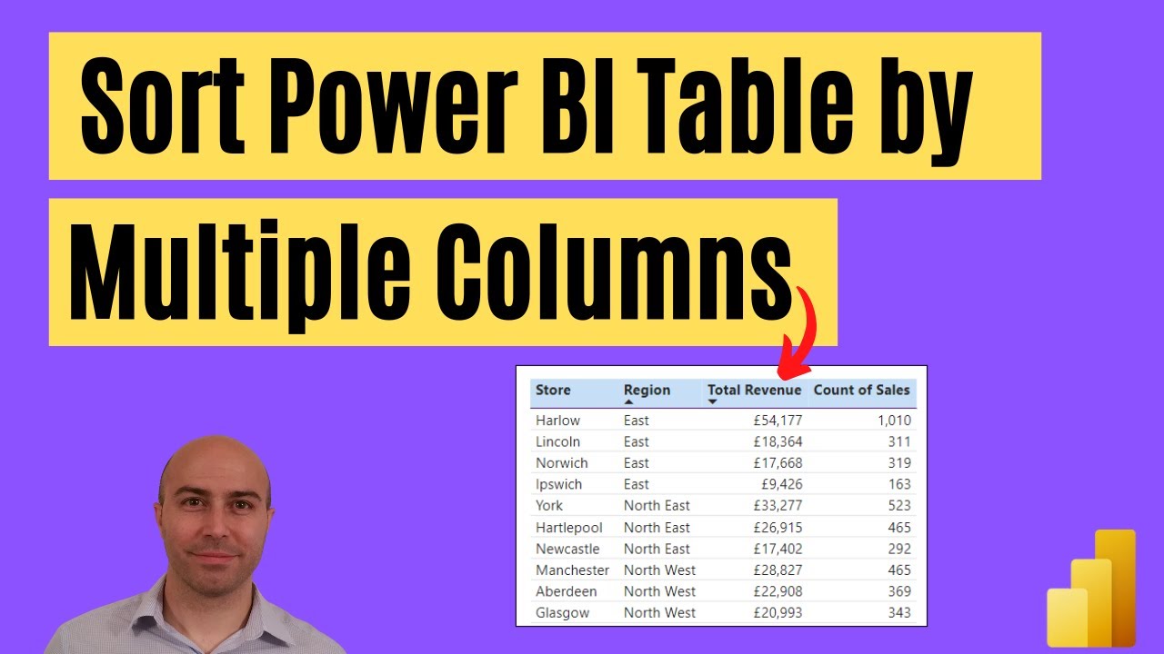
Adding Multiple Columns: A Step-by-Step Guide
Adding multiple columns to a Power BI Matrix is a simple process. To begin, select the Matrix visualization and navigate to the “Fields” pane. Drag and drop the desired fields into the “Columns” section of the “Values” area. By default, Power BI will create a new column for each field. To move a field to a different column, simply click and drag the field to the desired location.
To add additional columns, repeat the process of dragging and dropping fields into the “Columns” section. You can add as many columns as needed, allowing you to compare and contrast a wide range of data points. It is important to note that adding too many columns can make the Matrix difficult to read and interpret. Therefore, it is recommended to limit the number of columns to only those that are necessary for your analysis.
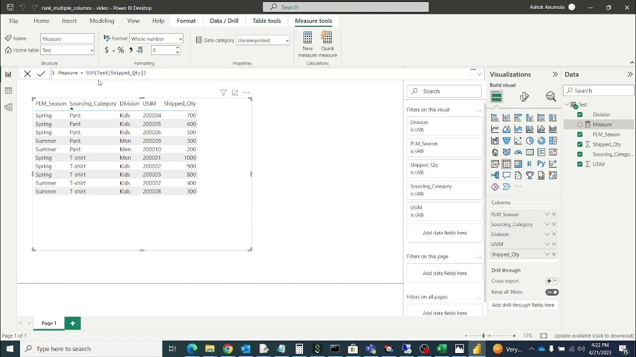
For a visual guide, refer to the following screenshots:


In the first screenshot, we have added a “Region” field to the Matrix, creating a new column. In the second screenshot, we have added a “Sales” field, creating a second column for sales data.

Maximizing Insights: Organizing Multiple Columns
Organizing multiple columns in a Power BI Matrix is crucial for maximizing insights and effectively communicating data. Here are some best practices to consider:
- Group related data: Group related data together in the same column to make it easier for users to understand the relationships between different data points. For example, group all sales data in one column and all cost data in another column.
- Use color coding: Use color coding to differentiate between different columns and draw attention to important data. For example, use a green color for positive values and a red color for negative values.
- Limit the number of columns: Limit the number of columns to only those that are necessary for your analysis. Adding too many columns can make the Matrix difficult to read and interpret.
- Adjust column width: Adjust the width of each column to ensure that the data is easily readable. Make sure that the text is not cut off and that there is enough white space between columns.
- Sort columns: Sort columns in a logical order to make it easier for users to follow the data. For example, sort columns in ascending or descending order based on the values in the column.
By following these best practices, you can effectively organize multiple columns in a Power BI Matrix and maximize the insights that you can gain from your data.
Real-World Application: Case Study on Multiple Columns
To better understand the power of multiple columns in a Power BI Matrix, let’s consider a real-world example. Imagine that you are an analyst for a retail company, and you want to analyze sales data for the past year. You have data on sales by region, product category, and salesperson. To effectively visualize this data, you can create a Power BI Matrix with multiple columns.
First, you would add the “Region” field to the Columns section of the Matrix. This would create a separate column for each region, allowing you to compare sales data across different regions. Next, you would add the “Product Category” field to the Rows section of the Matrix. This would create a separate row for each product category, allowing you to compare sales data across different categories.
Finally, you would add the “Sales” field to the Values section of the Matrix. This would create a separate column for sales data, allowing you to compare sales figures across different regions and product categories. By using multiple columns in this way, you can quickly and easily identify trends and patterns in your data, such as which regions or product categories are driving the most sales.
This is just one example of how multiple columns can be used in a Power BI Matrix to effectively display and analyze complex data sets. By experimenting with different column configurations, you can unlock new insights and drive better decision-making in your organization.
Advanced Techniques: Nested Matrices and Drill-Through Filters
Once you have mastered the basics of adding multiple columns to a Power BI Matrix, you can explore more advanced techniques to further enhance your data visualization. Two such techniques are nested matrices and drill-through filters.
Nested Matrices
Nested matrices allow you to create a Matrix within a Matrix, enabling you to compare and contrast data at multiple levels of detail. For example, you could create a nested Matrix to compare sales data by region, product category, and salesperson. This would allow you to see not only overall sales figures for each region and product category, but also individual sales figures for each salesperson within those categories.
To create a nested Matrix, simply drag and drop a field into the “Values” section of an existing Matrix. Power BI will automatically create a new Matrix within the first one, allowing you to compare and contrast data at a more detailed level.
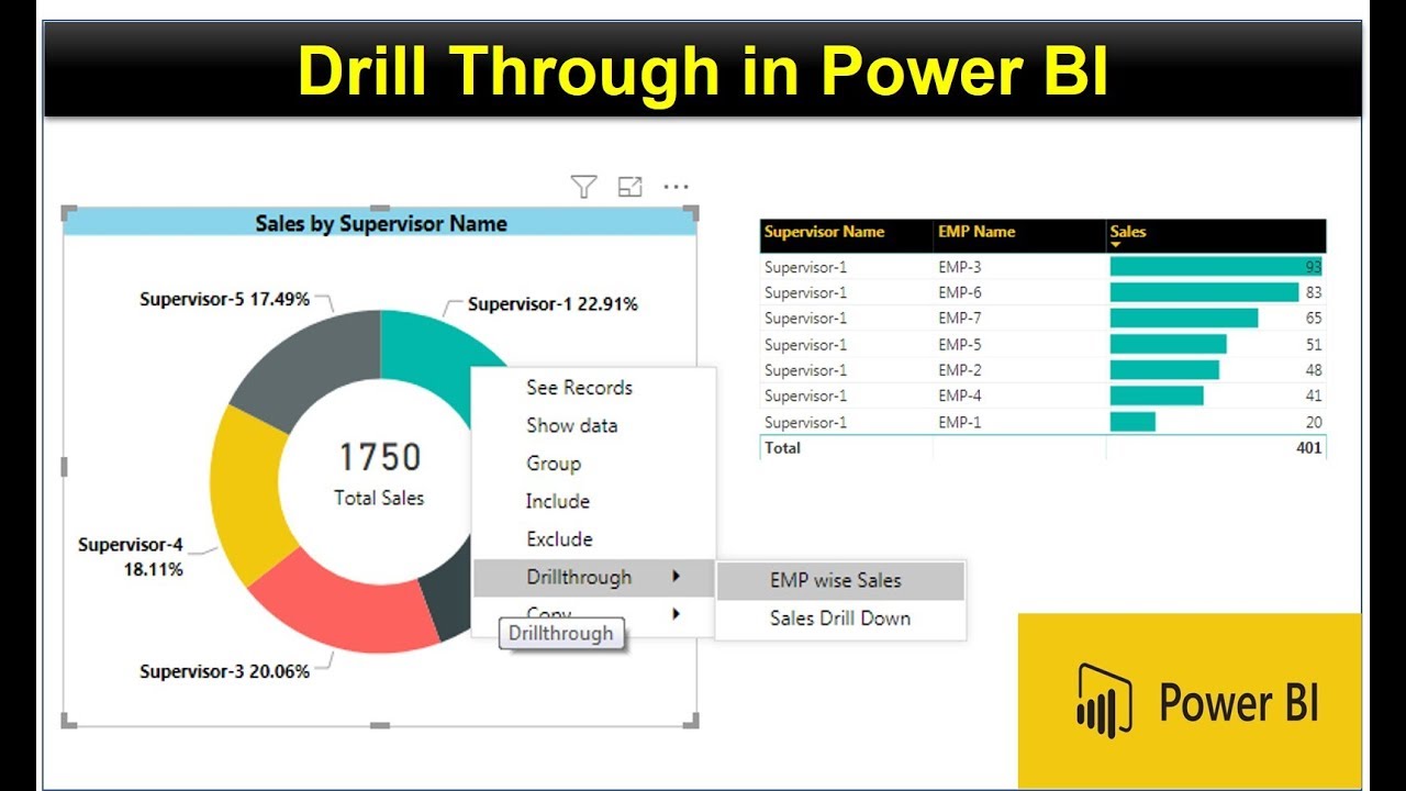
Drill-Through Filters
Drill-through filters allow you to quickly and easily filter data based on a specific value. For example, you could create a drill-through filter to view sales data for a specific region or product category. This would allow you to quickly and easily drill down into the data to gain deeper insights.
To create a drill-through filter, simply right-click on a value in a Matrix and select “Drill Through.” This will open a new page with a filtered view of the data, allowing you to explore it in more detail.
By using nested matrices and drill-through filters, you can take your Power BI Matrix visualizations to the next level, enabling you to gain deeper insights and make more informed decisions.
Troubleshooting Common Issues: Tips and Tricks
While working with multiple columns in a Power BI Matrix can be a powerful tool for data analysis, it can also present some challenges. Here are some common issues and how to troubleshoot them:
Formatting Problems
When working with multiple columns, it’s important to ensure that the formatting is consistent across all columns. However, it’s easy for formatting to get out of sync, leading to confusion and inaccurate data analysis. To avoid formatting problems, consider using the “Format” pane to apply consistent formatting to all columns at once.
Filtering Problems
Filtering is an essential part of data analysis, but it can be challenging when working with multiple columns. It’s easy to accidentally filter out data that you want to include, leading to incomplete or inaccurate results. To avoid filtering problems, consider using the “Filter” pane to apply filters to all columns at once, and double-check your filters before running any analysis.
Performance Problems
Working with multiple columns in a Power BI Matrix can be resource-intensive, leading to performance problems such as slow load times or crashes. To avoid performance problems, consider limiting the number of columns you use, and optimizing your data model for performance.
By following these tips and tricks, you can troubleshoot common issues when working with multiple columns in a Power BI Matrix, ensuring accurate and efficient data analysis.
Conclusion: The Power of Multiple Columns in Power BI Matrix
In conclusion, the Power BI Matrix is a powerful tool for data visualization, and the ability to display multiple columns is a key feature that can greatly enhance your analysis. By following the step-by-step guide and best practices for organizing multiple columns, you can effectively display and analyze complex data sets.
In addition, advanced techniques such as nested matrices and drill-through filters can take your Power BI Matrix visualizations to the next level, enabling you to gain deeper insights and make more informed decisions.
Of course, working with multiple columns in a Power BI Matrix can present some challenges, but by following the troubleshooting tips and tricks provided, you can overcome these issues and ensure accurate and efficient data analysis.
So don’t be afraid to experiment with multiple columns in your Power BI Matrix visualizations. With a little practice and know-how, you can unlock the full potential of this powerful tool and take your data analysis to new heights.