What is Power BI and Why is it Important?
Power BI is a powerful data visualization and business intelligence tool developed by Microsoft. It empowers data-driven organizations by providing a robust platform for data analysis, reporting, and decision-making. By learning Power BI, users can enhance their data analysis, reporting, and decision-making skills, ultimately contributing to the growth and success of their organizations. As a comprehensive learning path, mastering Power BI involves understanding its purpose, features, and benefits. Power BI offers an intuitive user interface, seamless integration with other Microsoft tools and services, and a vast library of visualization options. These features enable users to create stunning, interactive reports and dashboards that help them make informed decisions based on data.
Moreover, Power BI supports real-time data streaming, enabling users to monitor and analyze data as it arrives. This capability is particularly useful for businesses that require up-to-the-minute insights to stay competitive. Additionally, Power BI offers advanced security features, ensuring that sensitive data remains protected and accessible only to authorized users.
In summary, Power BI is an indispensable tool for data-driven organizations, and learning Power BI can significantly enhance one’s data analysis, reporting, and decision-making skills. By mastering Power BI, users can unlock the full potential of their data and contribute to the growth and success of their organizations.
Getting Started with Power BI: Setting Up Your Account and Environment
To begin your Power BI learning path, you’ll first need to create a Power BI account and set up your environment. This process is straightforward and can be completed in a few simple steps.
Visit the Power BI website (https://powerbi.microsoft.com/en-us/) and click on the “Sign up” button.
Choose between a work or school account or a personal Microsoft account.
Follow the on-screen instructions to complete the sign-up process.
Once your account is set up, log in to the Power BI service and familiarize yourself with the user interface.
Now that you have a Power BI account, it’s time to set up your workspace and connect to data sources. A workspace is a dedicated area in Power BI where you can store and manage your content. To create a workspace:
Click on the “Workspaces” button in the left-hand navigation pane.
Click on the “Create a workspace” button.
Enter a name for your workspace, add members if necessary, and configure the workspace settings according to your preferences.
To connect to data sources, you can use Power BI’s built-in connectors, which support various data formats, including Excel, CSV, SQL Server, and more. Here’s how to connect to a data source:
Click on the “Home” button in the left-hand navigation pane.
Click on the “Get data” button in the “Datasets” section.
Choose the data source you want to connect to and follow the on-screen instructions to complete the connection process.
By following these steps, you’ll be well on your way to mastering Power BI and unlocking the full potential of your data.

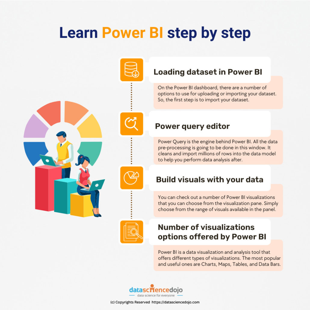
Building Your First Power BI Dashboard: A Step-by-Step Guide
Now that you have a Power BI account and are familiar with the platform, it’s time to build your first dashboard. A Power BI dashboard is a single page that displays visualizations, reports, and datasets, providing a comprehensive view of your data. Here’s a step-by-step guide to building your first Power BI dashboard:
Prepare your data: Before building your dashboard, ensure that your data is clean, transformed, and shaped for analysis. Use Power Query and DAX to model your data and create relationships between tables.
Create a report: A report is a collection of visualizations that are based on a single dataset. To create a report, click on the “Create” button in the left-hand navigation pane and select “Report.” Then, add visualizations to the report by clicking on the “Visualizations” pane and selecting the desired visualization type.
Add visualizations to the dashboard: Once you have created a report, you can add visualizations to the dashboard. To do this, click on the “Pin visual” button in the top right-hand corner of the visualization. Then, select the dashboard where you want to add the visualization.
Customize the dashboard: Power BI provides various customization options for dashboards, such as resizing visualizations, adding tiles, and rearranging the layout. Use these options to create a dashboard that meets your specific needs.
Share the dashboard: After building your dashboard, you can share it with team members, stakeholders, or anyone with a Power BI account. To share a dashboard, click on the “Share” button in the top right-hand corner of the dashboard and enter the email addresses of the people you want to share it with.
By following these steps, you can build an effective Power BI dashboard that provides valuable insights and helps you make informed decisions. Remember to keep your dashboard simple, focused, and actionable, and to update it regularly as your data and business needs change.
Data Modeling and Transformation in Power BI
Data modeling and transformation are crucial steps in the Power BI learning path, as they enable you to clean, transform, and shape your data for analysis. Power BI provides two powerful tools for data modeling and transformation: Power Query and Data Analysis Expressions (DAX). Power Query is an Extract, Transform, Load (ETL) tool that allows you to connect to various data sources, clean and transform your data, and load it into Power BI. Power Query provides a user-friendly interface that enables you to perform data transformations using a drag-and-drop interface. Additionally, Power Query supports M, a functional programming language that allows you to create custom data transformations.
DAX is a formula language that enables you to create complex calculations and expressions in Power BI. DAX provides various functions and operators that allow you to manipulate and analyze data in Power BI. By mastering DAX, you can create advanced calculations and KPIs that provide valuable insights into your data.
When modeling data in Power BI, it’s essential to create a logical and efficient data model that supports your reporting needs. This involves creating relationships between tables, defining measures and calculated columns, and optimizing your data model for performance.
Here are some best practices for optimizing your data model in Power BI:
Create relationships between tables: Creating relationships between tables enables you to aggregate and analyze data across multiple tables. Power BI supports various relationship types, including one-to-many, many-to-one, and many-to-many relationships.
Define measures and calculated columns: Measures and calculated columns enable you to create custom calculations and expressions in Power BI. Measures are dynamic calculations that are recalculated based on the current context, while calculated columns are static calculations that are stored in the data model.
Optimize your data model for performance: Optimizing your data model for performance involves reducing the number of relationships, minimizing the use of calculated columns, and leveraging Power BI’s query folding capabilities. Query folding enables Power BI to push data transformations down to the data source, reducing the amount of data that needs to be loaded into Power BI.
By mastering data modeling and transformation in Power BI, you can create efficient and effective data models that provide valuable insights into your data. Remember to leverage Power Query and DAX to clean, transform, and shape your data, and to optimize your data model for performance.
Creating Advanced Visualizations and Reports in Power BI
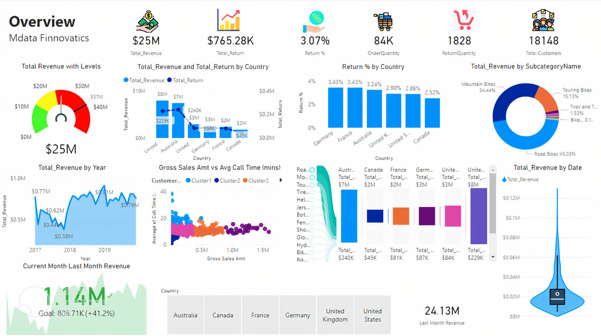
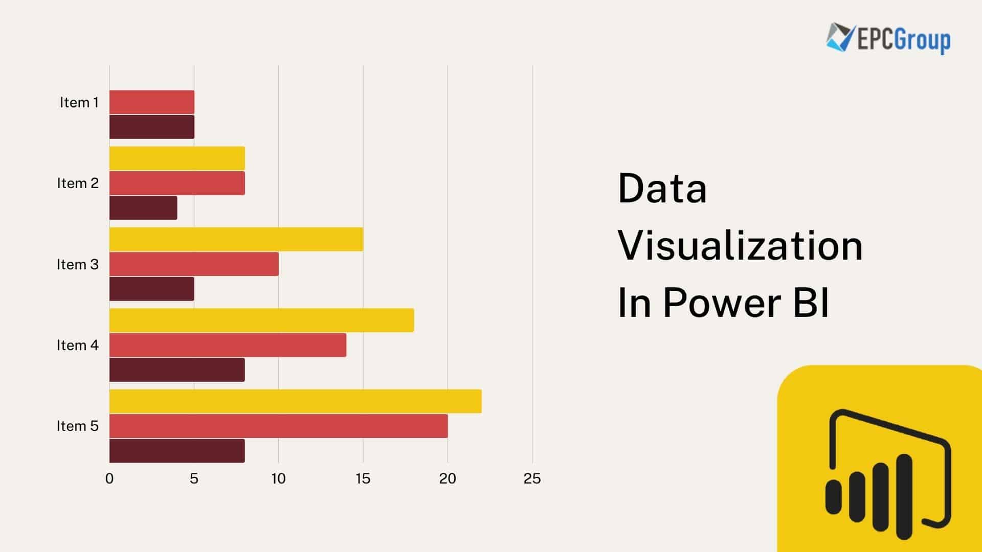
Power BI offers a wide range of visualization options that enable you to create advanced reports and dashboards that provide valuable insights into your data. In this section of the Power BI learning path, we will explore the various visualization options available in Power BI, including custom visuals, and how to create advanced reports using filters, slicers, and drill-through capabilities. Power BI provides a variety of built-in visualizations, including bar charts, column charts, line charts, area charts, scatter charts, and more. These visualizations can be customized to meet your specific needs, allowing you to change the colors, styles, and formatting to match your brand or preferences.
In addition to built-in visualizations, Power BI also supports custom visuals, which are third-party visualizations that can be added to your reports and dashboards. Custom visuals provide additional functionality and flexibility, enabling you to create unique and innovative visualizations that are not available in the built-in library.
To create advanced reports in Power BI, you can use filters, slicers, and drill-through capabilities. Filters allow you to narrow down the data displayed in a visualization based on specific criteria, while slicers enable you to filter data using interactive controls. Drill-through capabilities allow you to navigate between reports and visualizations, providing a more detailed view of your data.
Here are some best practices for creating advanced visualizations and reports in Power BI:
Choose the right visualization: Selecting the appropriate visualization is crucial for effectively communicating your data. Consider the type of data you are working with, the insights you want to convey, and the audience you are targeting when choosing a visualization.
Customize your visualizations: Customizing your visualizations can help you create a more engaging and informative report. Experiment with different formatting options, such as colors, fonts, and labels, to create a visualization that meets your specific needs.
Use filters and slicers: Filters and slicers enable you to interact with your data in real-time, providing a more dynamic and engaging experience. Use filters and slicers to enable users to explore the data and uncover insights.
Leverage custom visuals: Custom visuals provide additional functionality and flexibility, enabling you to create unique and innovative visualizations that are not available in the built-in library. Consider using custom visuals to create a more engaging and interactive report.
By mastering advanced visualizations and reports in Power BI, you can create powerful and informative dashboards that provide valuable insights into your data. Remember to choose the right visualization, customize your visualizations, use filters and slicers, and leverage custom visuals to create a more engaging and interactive report.
Collaboration, Sharing, and Publishing Power BI Reports
Power BI enables users to collaborate, share reports, and publish dashboards with team members, stakeholders, and clients. In this section of the Power BI learning path, we will explore how to collaborate with team members, share reports, and publish dashboards in Power BI. We will also discuss the security and access control features, and how to ensure data privacy and compliance. Collaboration is a critical aspect of data analysis and reporting. Power BI enables users to collaborate with team members in real-time, using features such as comments, annotations, and shared views. Users can also use Power BI’s collaboration features to work together on reports, dashboards, and datasets, enabling them to create more accurate and insightful data visualizations.
Sharing reports and dashboards is another essential feature of Power BI. Users can share reports and dashboards with other Power BI users, either individually or in groups. Power BI provides various sharing options, including email, link sharing, and embedding in other applications. Users can also set permissions and access controls, ensuring that sensitive data is only accessible to authorized users.
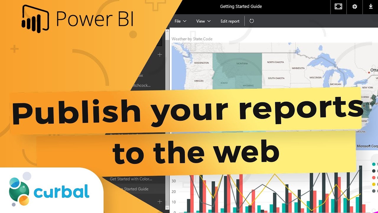
Publishing dashboards is another way to share data visualizations with a broader audience. Power BI enables users to publish dashboards to the web, enabling them to share data visualizations with clients, stakeholders, and the public. Users can also embed Power BI dashboards in other applications, such as SharePoint, Teams, and Power Apps, providing a more integrated and seamless user experience.
Here are some best practices for collaborating, sharing, and publishing Power BI reports:
Set permissions and access controls: Setting permissions and access controls is crucial for ensuring data privacy and compliance. Use Power BI’s security features to set permissions and access controls, and ensure that sensitive data is only accessible to authorized users.
Use comments and annotations: Comments and annotations enable users to collaborate in real-time, providing feedback and suggestions on reports and dashboards. Use Power BI’s commenting and annotation features to collaborate with team members and stakeholders.
Share reports and dashboards selectively: Sharing reports and dashboards selectively is essential for maintaining data privacy and security. Use Power BI’s sharing options to share reports and dashboards with specific users or groups, and ensure that sensitive data is only accessible to authorized users.
Publish dashboards strategically: Publishing dashboards strategically is crucial for reaching a broader audience. Use Power BI’s publishing options to publish dashboards to the web or embed them in other applications, and ensure that data visualizations are accessible to the intended audience.
By mastering collaboration, sharing, and publishing in Power BI, you can create more accurate and insightful data visualizations, and share them with a broader audience. Remember to set permissions and access controls, use comments and annotations, share reports and dashboards selectively, and publish dashboards strategically to create a more engaging and informative data visualization experience.
Integrating Power BI with Other Microsoft Tools and Services
Power BI is a powerful data visualization and business intelligence tool that can be integrated with other Microsoft tools and services to streamline data analysis and reporting workflows. In this section of the Power BI learning path, we will explore how Power BI integrates with other Microsoft tools and services, such as Excel, Power Automate, and Teams, and provide examples and best practices for integrating Power BI in a Microsoft-centric environment. Microsoft Excel is a popular spreadsheet application that is widely used for data analysis and reporting. Power BI integrates seamlessly with Excel, enabling users to import Excel data into Power BI, and use Power BI’s data modeling and visualization features to create more sophisticated and insightful reports. Power BI also supports Excel’s Power Pivot and Power Query features, enabling users to create complex data models and perform advanced data transformations.
Power Automate is a cloud-based automation platform that enables users to automate repetitive tasks and workflows. Power BI integrates with Power Automate, enabling users to trigger Power BI actions based on specific events or conditions. For example, users can set up a Power Automate workflow that sends a Power BI report to a specific user or group when a new data source is added to Power BI.
Microsoft Teams is a collaboration platform that enables users to communicate, share files, and collaborate on projects in real-time. Power BI integrates with Teams, enabling users to share Power BI reports and dashboards directly in Teams channels and chats. Users can also use Teams’ Power BI app to access Power BI reports and dashboards directly from Teams.
Here are some best practices for integrating Power BI with other Microsoft tools and services:
Use Power BI’s Excel integration to import Excel data: Power BI’s Excel integration enables users to import Excel data into Power BI, and use Power BI’s data modeling and visualization features to create more sophisticated and insightful reports.
Use Power Automate to automate Power BI workflows: Power Automate enables users to automate repetitive tasks and workflows in Power BI. Use Power Automate to trigger Power BI actions based on specific events or conditions.
Use Teams’ Power BI app to access Power BI reports and dashboards: Teams’ Power BI app enables users to access Power BI reports and dashboards directly from Teams. Use Teams’ Power BI app to collaborate with team members and share Power BI reports and dashboards.
Use Power BI’s custom visuals to create custom visualizations: Power BI’s custom visuals enable users to create custom visualizations that are not available in Power BI’s built-in visualization library. Use custom visuals to create more engaging and informative data visualizations.
By mastering Power BI’s integration with other Microsoft tools and services, you can streamline data analysis and reporting workflows, and create more engaging and informative data visualizations. Remember to use Power BI’s Excel integration to import Excel data, use Power Automate to automate Power BI workflows, use Teams’ Power BI app to access Power BI reports and dashboards, and use Power BI’s custom visuals to create custom visualizations to create a more integrated and seamless data visualization experience.
Continuous Learning and Improvement: Staying Updated with Power BI
Power BI is a constantly evolving platform, with new features, updates, and community resources being added regularly. In this section of the Power BI learning path, we will discuss the importance of continuous learning and improvement in Power BI, and provide tips and best practices for staying updated with new features, updates, and community resources. Staying updated with new features and updates is crucial for getting the most out of Power BI. Microsoft releases new features and updates for Power BI regularly, and it’s essential to stay up-to-date with these changes to take advantage of new capabilities and improvements. Power BI’s release notes provide a comprehensive list of new features and updates, and users can also subscribe to Power BI’s blog to receive updates on new features and improvements.
Joining user groups and attending webinars is another excellent way to stay updated with Power BI. User groups provide a forum for Power BI users to connect, share knowledge, and learn from each other. User groups often host webinars, workshops, and other events that provide an opportunity to learn from Power BI experts and thought leaders. Power BI’s community page provides a list of user groups and upcoming events.
Participating in forums and discussions is another way to stay updated with Power BI. Power BI’s community page provides a forum for users to ask questions, share knowledge, and provide feedback on Power BI. Participating in forums and discussions can help users stay up-to-date with new features and updates, as well as connect with other Power BI users and experts.
Here are some best practices for continuous learning and improvement in Power BI:
Stay up-to-date with new features and updates: Staying up-to-date with new features and updates is crucial for getting the most out of Power BI. Use Power BI’s release notes and blog to stay informed about new features and updates.
Join user groups and attend webinars: Joining user groups and attending webinars provides an opportunity to learn from Power BI experts and thought leaders. User groups often host webinars, workshops, and other events that provide an opportunity to learn new skills and connect with other Power BI users.
Participate in forums and discussions: Participating in forums and discussions provides an opportunity to connect with other Power BI users and experts, ask questions, and share knowledge. Power BI’s community page provides a forum for users to participate in discussions and provide feedback on Power BI.
Experiment with new features and capabilities: Experimenting with new features and capabilities is an excellent way to learn new skills and improve existing ones. Use Power BI’s trial version to experiment with new features and capabilities.
By following these best practices, you can stay updated with new features, updates, and community resources in Power BI, and continue to improve your data analysis, reporting, and decision-making skills. Remember to stay up-to-date with new features and updates, join user groups and attend webinars, participate in forums and discussions, and experiment with new features and capabilities to create a more engaging and informative data visualization experience.