
Power BI: An In-Depth Look
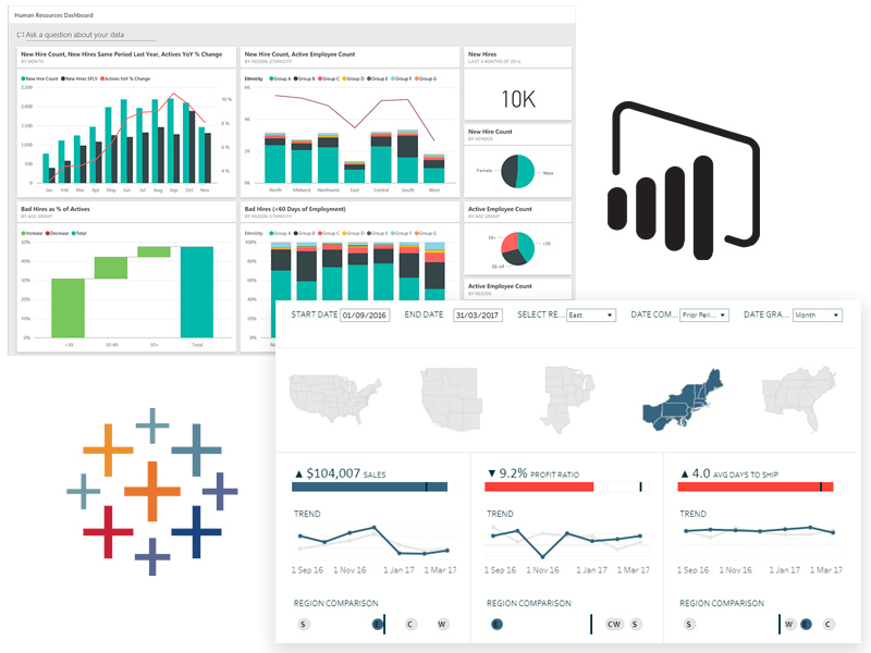
Microsoft’s Power BI is a cloud-based business analytics service that offers interactive visualizations and robust business intelligence capabilities. Power BI is designed to provide a unified platform for data preparation, visualization, and analysis, enabling organizations to derive valuable insights from their data. This powerful tool is built on the foundation of Excel, making it an intuitive choice for users familiar with Microsoft’s spreadsheet program.
Power BI’s feature set includes data modeling, which allows users to create custom relationships between tables, and the implementation of advanced calculations using the DAX (Data Analysis Expressions) language. Additionally, Power BI offers a wide range of built-in and custom visualizations, making it easy for users to represent their data in an engaging and informative manner. Power BI also supports real-time data streaming, allowing organizations to monitor and analyze data as it is generated.
One of the primary advantages of Power BI is its seamless integration with other Microsoft products, such as Excel, SharePoint, and Teams. This compatibility enables organizations to leverage their existing investments in Microsoft technologies while expanding their data analytics capabilities. Power BI also boasts a large and active user community, which provides a wealth of resources, tutorials, and templates for users to draw upon.
Despite its many strengths, Power BI does have some limitations. For instance, it may not be the best choice for organizations with significant on-premises data infrastructure, as its cloud-based nature can make integrating with on-premises data sources more challenging. Additionally, while Power BI offers robust data modeling capabilities, it may not be as powerful as some dedicated data modeling tools, such as SQL Server Analysis Services.

Tableau: A Comprehensive Review
Tableau, a data visualization software company owned by Salesforce, offers a powerful platform for data analysis and visualization. Tableau is designed to help people see and understand their data, providing a wide range of features and capabilities to support data exploration, visualization, and storytelling.
Tableau’s core offerings include Tableau Desktop, Tableau Server, and Tableau Online. Tableau Desktop is a powerful data visualization tool that allows users to connect to various data sources, perform data transformations, and create interactive visualizations. Tableau Server and Tableau Online enable users to share their visualizations and dashboards with others, either on-premises or in the cloud.
One of Tableau’s primary strengths is its ease of use, particularly when it comes to data visualization. Tableau’s drag-and-drop interface makes it easy for users to create visualizations without requiring extensive technical expertise. Additionally, Tableau offers a wide range of built-in visualizations, enabling users to represent their data in a variety of ways, from simple bar charts to complex heat maps.
Tableau also supports real-time data streaming, allowing organizations to monitor and analyze data as it is generated. It also offers a robust set of data modeling capabilities, enabling users to create complex data models and perform advanced calculations. Tableau’s collaboration features are also noteworthy, allowing users to share visualizations and dashboards with others and collaborate on data analysis in real-time.
Despite its many strengths, Tableau does have some limitations. For instance, it may not be the best choice for organizations with significant on-premises data infrastructure, as its cloud-based offerings can make integrating with on-premises data sources more challenging. Additionally, while Tableau offers robust data modeling capabilities, it may not be as powerful as some dedicated data modeling tools, such as SQL Server Analysis Services.
Head-to-Head Comparison: Power BI vs Tableau
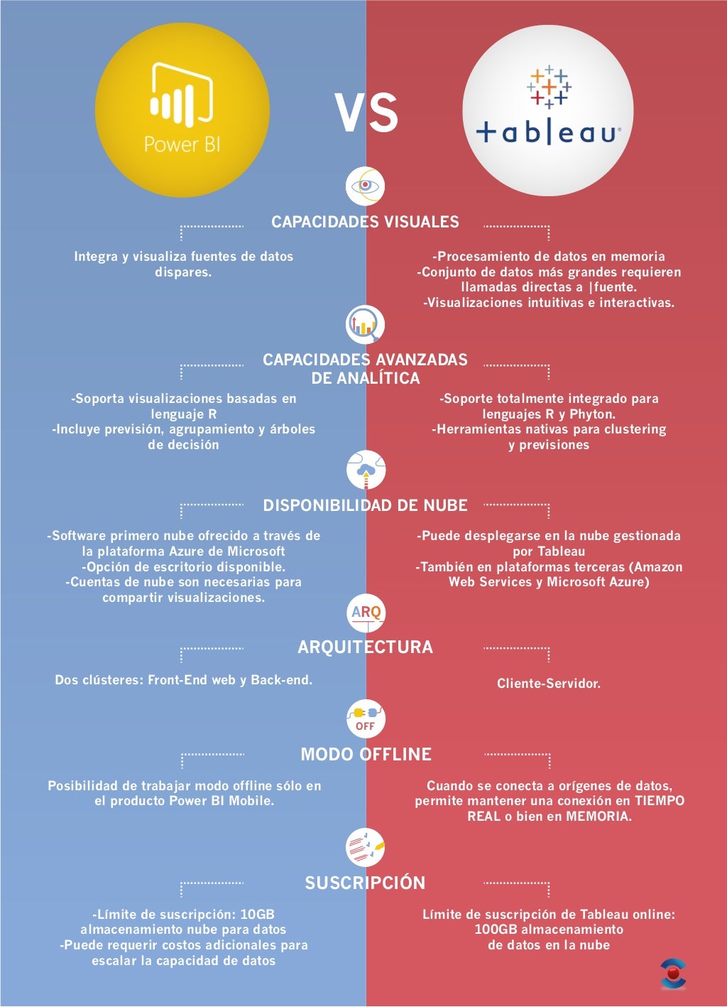
When it comes to data visualization tools, Power BI and Tableau are two of the most popular options available. Both tools offer a wide range of features and capabilities, but they differ in several key areas. In this section, we will compare Power BI and Tableau based on various factors such as ease of use, data connectivity, data visualization capabilities, and cost.
Ease of Use
Both Power BI and Tableau are designed to be user-friendly, with intuitive interfaces and drag-and-drop functionality. However, Power BI may have a slight edge in this category, as it is built on the foundation of Excel, making it a more familiar choice for users who are already familiar with Microsoft’s spreadsheet program. Tableau, on the other hand, offers a more flexible and customizable interface, which may be preferred by users who require more control over their visualizations.
Data Connectivity
Both Power BI and Tableau offer a wide range of data connectors, enabling users to connect to various data sources, including Excel, SQL Server, and cloud-based data sources such as Salesforce and Google Analytics. Power BI, however, offers a more extensive range of connectors, particularly when it comes to cloud-based data sources. Power BI also offers real-time data streaming capabilities, which may be preferred by organizations that require real-time data analysis.
Data Visualization Capabilities
Both Power BI and Tableau offer a wide range of data visualization options, from simple charts and graphs to more complex visualizations such as heat maps and Gantt charts. Power BI offers a more extensive range of built-in visualizations, while Tableau offers more flexibility and customization options. Power BI also offers a wider range of mapping capabilities, making it a better choice for organizations that require location-based data analysis.
Cost
Power BI offers a free version, Power BI Free, as well as a paid version, Power BI Pro, which starts at $9.99 per user per month. Tableau, on the other hand, offers a more complex pricing model, with Tableau Desktop starting at $70 per user per month and Tableau Server starting at $35 per user per month. Power BI may be a more cost-effective choice for smaller organizations or those with more basic data visualization needs.
Unique Features
Power BI offers several unique features, including real-time data streaming, natural language processing, and AI-powered insights. Tableau, on the other hand, offers a more flexible and customizable interface, as well as advanced data modeling capabilities. Tableau also offers a more extensive range of collaboration features, making it a better choice for organizations that require real-time collaboration and data sharing.
Choosing the Right Tool for Your Business
After exploring Power BI and Tableau in detail, you may be wondering which tool is the best fit for your organization. The answer depends on several factors, including your specific needs, requirements, and budget.
Power BI may be the better choice for organizations that require real-time data streaming, natural language processing, or AI-powered insights. Power BI is also a more cost-effective choice for smaller organizations or those with more basic data visualization needs. Additionally, Power BI’s integration with Microsoft’s suite of products may be a deciding factor for organizations that heavily rely on Microsoft technologies.
Tableau, on the other hand, may be the better choice for organizations that require more advanced data modeling capabilities, real-time collaboration, and data sharing. Tableau’s flexible and customizable interface may also be preferred by organizations that require more control over their visualizations. Additionally, Tableau’s extensive range of collaboration features may be a deciding factor for organizations that require real-time collaboration and data sharing.
If your organization is already using one of these tools, it may be more cost-effective to optimize your current platform rather than making a transition to the other tool. However, if your organization is not yet using either tool, it’s essential to evaluate your specific needs and requirements before making a decision. Consider factors such as data sources, visualization requirements, collaboration needs, and budget before making a decision.
If your organization does decide to make the transition from one tool to another, it’s essential to plan the transition carefully. This may involve training staff on the new tool, migrating data and visualizations, and updating existing reports and dashboards. It’s also essential to communicate the transition effectively to all stakeholders to ensure a smooth and successful implementation.

Real-World Applications: Case Studies and Success Stories
To better understand the practical applications of Power BI and Tableau, it’s helpful to look at real-world examples of how businesses have successfully implemented these tools for data visualization and business intelligence. In this section, we will highlight a few case studies and success stories to provide insights and inspiration for your own implementation.
Case Study: Power BI at a Global Manufacturing Company
A global manufacturing company used Power BI to integrate data from multiple sources, including ERP, CRM, and supply chain systems. By doing so, they were able to gain a unified view of their operations and make data-driven decisions in real-time. The implementation resulted in increased efficiency, reduced costs, and improved customer satisfaction.
Case Study: Tableau at a Retail Company
A retail company used Tableau to visualize sales data and identify trends and patterns. By doing so, they were able to optimize their inventory management, improve their marketing strategies, and increase revenue. The implementation resulted in a 10% increase in sales and a 5% decrease in inventory costs.
Success Story: Power BI at a Healthcare Organization
A healthcare organization used Power BI to visualize patient data and identify trends and patterns. By doing so, they were able to improve patient outcomes, reduce readmissions, and optimize resource allocation. The implementation resulted in a 15% decrease in readmissions and a 10% increase in patient satisfaction.
Success Story: Tableau at a Financial Services Firm
A financial services firm used Tableau to visualize financial data and identify trends and patterns. By doing so, they were able to optimize their investment strategies, reduce risks, and improve compliance. The implementation resulted in a 5% increase in revenue and a 3% decrease in compliance risks.
These case studies and success stories demonstrate the power of data visualization tools like Power BI and Tableau. By providing a clear and intuitive view of complex data, these tools can help businesses make informed decisions, optimize their operations, and drive growth. When choosing between Power BI and Tableau, it’s essential to consider your specific needs and requirements, as well as your budget and existing technologies. With the right tool and a well-planned implementation, you can unlock the full potential of your data and drive business success.
![]()
Best Practices for Data Visualization
Regardless of which tool you choose, effective data visualization is crucial for communicating insights and driving action. In this section, we will provide best practices for data visualization, including tips on design, interactivity, and storytelling.
Design
When it comes to data visualization, design is key. A well-designed visualization can help you communicate complex data in a clear and concise way, making it easier for your audience to understand and act on the insights you provide. Here are some best practices for data visualization design:
- Keep it simple: Avoid clutter and stick to a few key metrics.
- Choose the right chart type: Different chart types are better suited to different types of data. Make sure you choose the right one for your data.
- Use color effectively: Color can be a powerful tool for highlighting important data points, but it can also be distracting if overused.
- Label everything: Make sure your audience can easily understand what each data point represents.
Interactivity
Interactivity is another critical component of effective data visualization. By allowing your audience to interact with your visualizations, you can help them gain a deeper understanding of the data and uncover insights that might not be immediately apparent. Here are some best practices for data visualization interactivity:
- Provide filters and drill-down capabilities: Allow your audience to filter the data and drill down into specific data points to gain a deeper understanding of the data.
- Use hover-over text: Provide additional context and information when your audience hovers over a data point.
- Include legends and tooltips: Make sure your audience can easily understand what each data point represents.
Storytelling
Finally, effective data visualization is about more than just charts and graphs. It’s about telling a story with your data, one that engages your audience and inspires them to take action. Here are some best practices for data visualization storytelling:
- Start with a clear question: What are you trying to answer with your data? Make sure your visualization is focused on answering that question.
- Use a narrative structure: Tell a story with your data, one that has a beginning, middle, and end.
- Provide context: Help your audience understand the broader context of the data, including any limitations or assumptions.
- End with a call to action: What do you want your audience to do with the insights you’ve provided? Make sure you provide a clear call to action.
By following these best practices, you can create effective data visualizations that communicate insights and drive action. Whether you choose Power BI or Tableau, these principles will help you get the most out of your data visualization platform.

Future Trends in Data Visualization
As data visualization continues to evolve, it’s essential to stay up-to-date with the latest trends and technologies. Here are some emerging trends in data visualization and how they may impact your organization’s use of Power BI and Tableau.
Artificial Intelligence and Machine Learning
Artificial intelligence (AI) and machine learning (ML) are becoming increasingly important in data visualization. These technologies can help automate the data visualization process, making it easier for users to create visualizations without needing advanced data analysis skills. Power BI and Tableau have both started to incorporate AI and ML capabilities into their platforms. For example, Power BI includes a feature called Quick Insights, which uses AI to automatically identify trends and patterns in data. Tableau has a feature called Tableau Prep, which uses ML to automate data preparation tasks.
Real-Time Data Visualization
Real-time data visualization is becoming more critical as businesses seek to make quicker and more informed decisions. Both Power BI and Tableau offer real-time data visualization capabilities. Power BI has a feature called Real-Time Dashboard, which updates data every few seconds. Tableau has a feature called Tableau Server, which allows users to create real-time visualizations that update automatically.
Interactive Visualizations
Interactive visualizations are becoming more popular as users seek to explore data in new and more engaging ways. Both Power BI and Tableau offer interactive visualization capabilities. Power BI includes a feature called Power BI Custom Visuals, which allows users to create custom visualizations that are interactive and engaging. Tableau has a feature called Tableau Public, which allows users to create interactive visualizations that can be shared on social media or embedded on websites.
Data Storytelling
Data storytelling is becoming more critical as businesses seek to communicate insights in a more engaging and compelling way. Both Power BI and Tableau offer data storytelling capabilities. Power BI includes a feature called Power BI Paginated Reports, which allows users to create reports that tell a story with data. Tableau has a feature called Tableau Story Points, which allows users to create a narrative around their data.
By staying up-to-date with these trends and technologies, your organization can ensure that you are getting the most out of your data visualization platform. Whether you choose Power BI or Tableau, these trends will help you stay ahead of the curve and make more informed decisions based on data.
Conclusion: Making an Informed Decision
After exploring Power BI and Tableau in detail, it’s clear that both tools have their strengths and weaknesses. The right tool for your organization will depend on your specific needs and requirements. Here are some key considerations to keep in mind when making your decision:
- Ease of use: If you’re looking for a tool that’s easy to use and requires minimal training, Power BI may be the better choice.
- Data connectivity: If you need to connect to a wide variety of data sources, Tableau may be the better choice.
- Data visualization capabilities: If you need advanced data visualization capabilities, Tableau may be the better choice.
- Cost: If you’re on a tight budget, Power BI may be the better choice.
Regardless of which tool you choose, effective data visualization is crucial for communicating insights and driving action. By following best practices for data visualization, including tips on design, interactivity, and storytelling, you can ensure that you’re getting the most out of your data visualization platform.
As data visualization continues to evolve, it’s essential to stay up-to-date with the latest trends and technologies. Emerging trends such as artificial intelligence, real-time data visualization, interactive visualizations, and data storytelling can help your organization stay ahead of the curve and make more informed decisions based on data.
Ultimately, the key to success with data visualization is to choose the right tool for your organization and to use it effectively. By following the guidance provided in this article, you can make an informed decision and start reaping the benefits of data visualization for your business.